Design Proposals from the Making Room 2011 Design Showcase
Hidden Housing: Local Addition
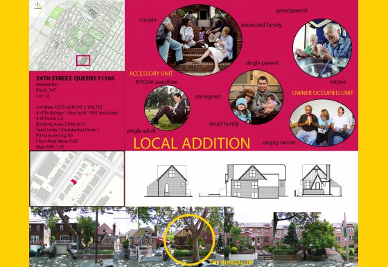
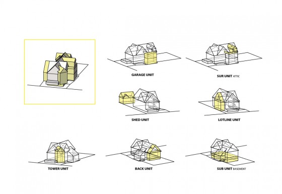
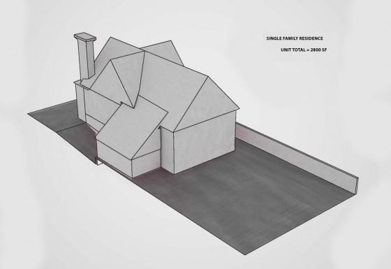
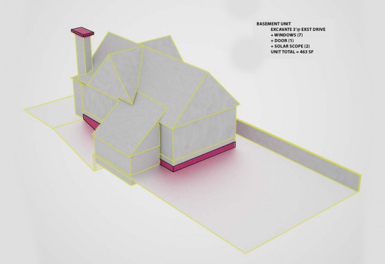
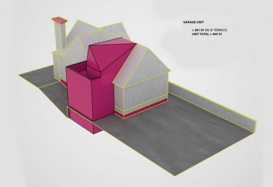
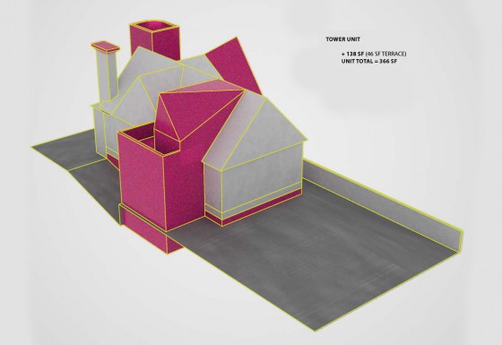
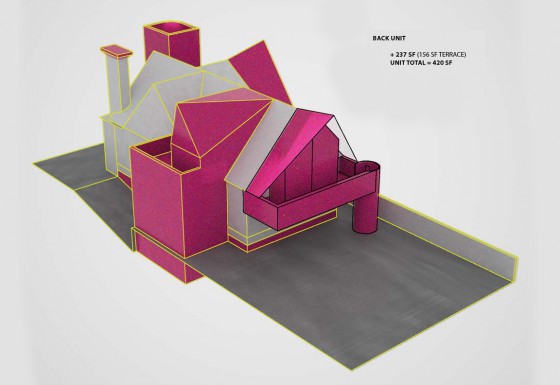
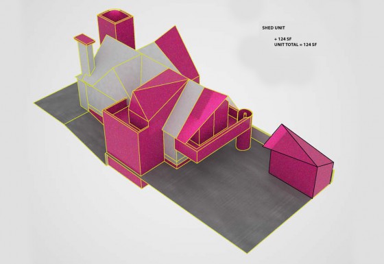
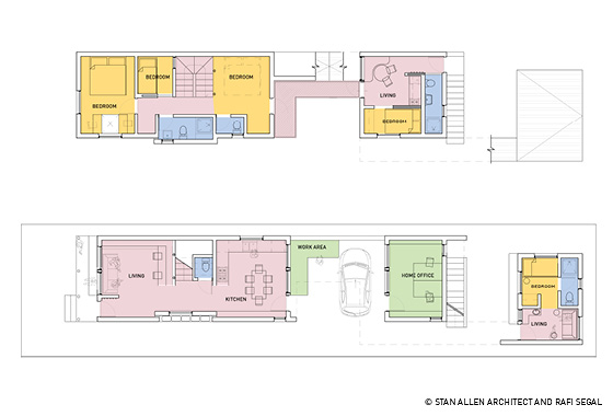
Local Addition is the transformation of a single family home with six new accessory dwelling units. The pink “barnacles” represent additional volume that both accommodates new occupancy and aggrandizes the house. The total of 7 units at 3700sf remains well under the permitted FAR of 1.5.
The six new accessory dwelling units reveal a puzzle of contrasting colors that retrofit the flexible bungalow housing type.
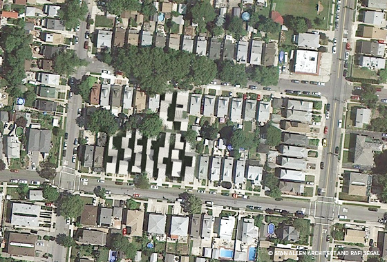
At the scale of the block, parking requirements increase due to the additional units. Parking is addressed by adding a mews. The mews is as much an urban amenity as parking lot, providing garden and play space for the block community.
Watch video of the team's full presentation
Download project PDF
no commentsUnpacking the Home: Under One Roof, Whitestone, Queens
Project team:
Stan Allen Architect, Rafi Segal A+U
Design team: Chris Oliver, Jessie Turnbull
Research: Alix Beranger, Whitney Brooks
Models: Jesus Yepez Mendoza
Re-thinking the detached single family house for an extended family
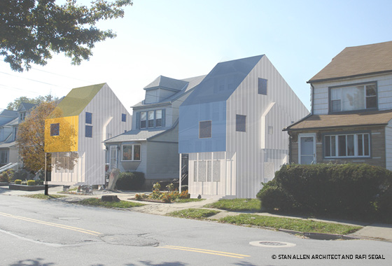
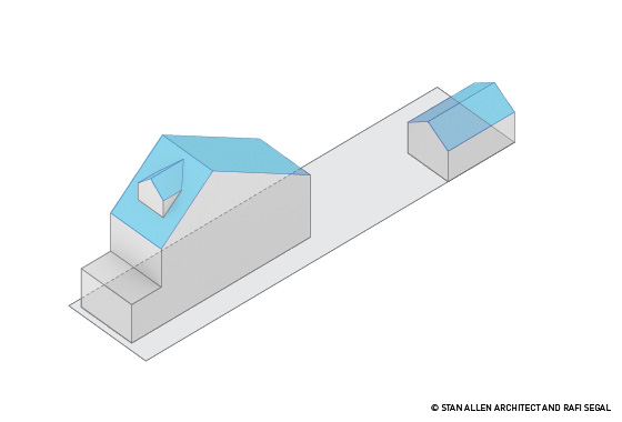
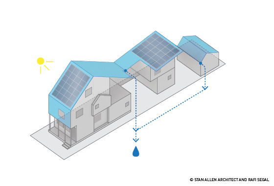
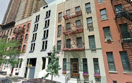
The roof of the traditional single-family house is extended into the depth of the lot to create a continuous multi-pitched roof structure, encompassing three individual but related units. While maintaining the existing façade towards the street, the house typology is transformed.
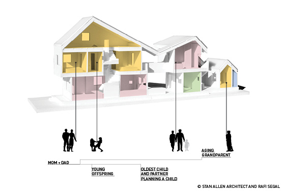
The existing typology of a single large house at the front of the lot with an arbitrarily inhabited backyard is replaced by a series of open, closed, and courtyard spaces, which allow for multiple configurations of family members and relatives within the units of the house.
This new organization is better suited for the living habits of extended, multi-generation families, who comprise today the majority of Queen’s growing population.
Watch video of the team's full presentation
Download project PDF
no commentsUnpacking the Home: 3 for 2
Project team:
Stan Allen Architect, Rafi Segal A+U
Design team: Chris Oliver, Jessie Turnbull
Research: Alix Beranger, Whitney Brooks
Models: Jesus Yepez Mendoza
MIDTOWN, MANHATTAN
Re-using the 1960s office tower
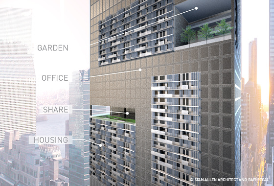
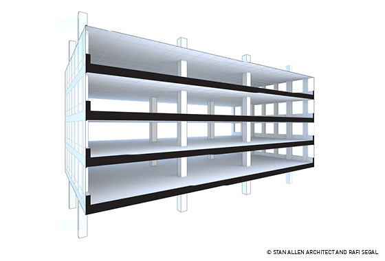
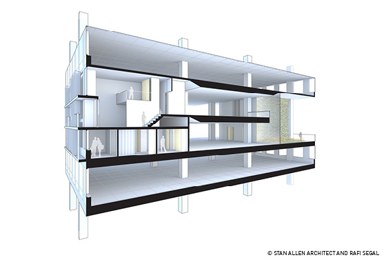
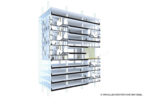
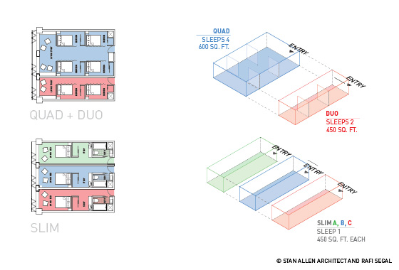
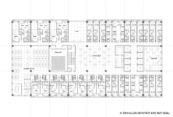
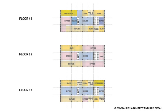
Using the prototypical structure of the 1960s office building, this proposal transforms underutilized commercial space to residential apartments and shared facilities.
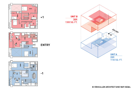
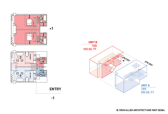
Two floors of the buildings outer structural bays are converted to three new residential levels, taking advantage of the discrepancy in floor heights between commercial and residential spaces. The central zone of the building is divided between smaller office use, shared work space and other collective programs. Vertical gardens puncture the façade of the building offering open park space to the inhabitants of the building.
Young professionals, single parents, couples with a new born, commuters, and others working long hours in the city can find a variety of unit sizes and accessibility to shared spaces and collective programs.
Watch video of the team's full presentation
Download project PDF
no commentsThe “Go-Home” for NYC: Shared Housing Tried & Tested
Project Team:
Smith & Others, San Diego
Students of the Masters in Real Estate Development program for architects at Woodbury University in Burbank, California
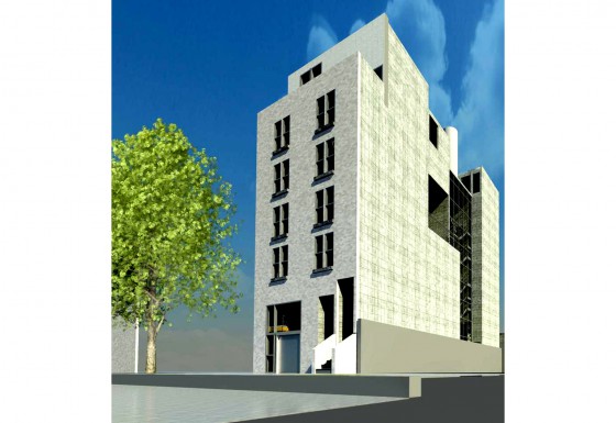
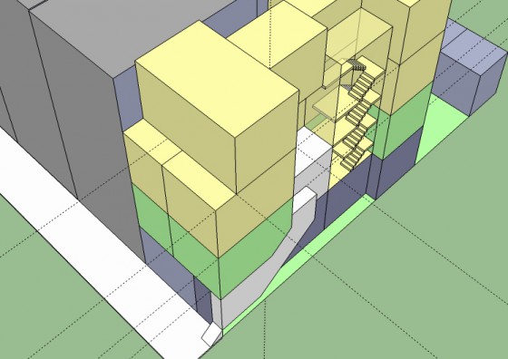
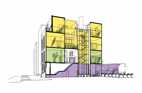
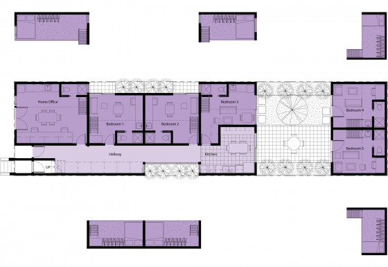
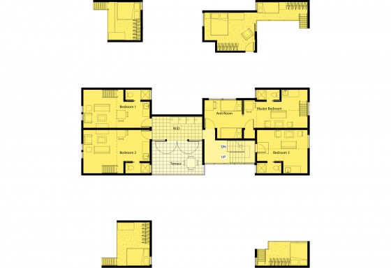
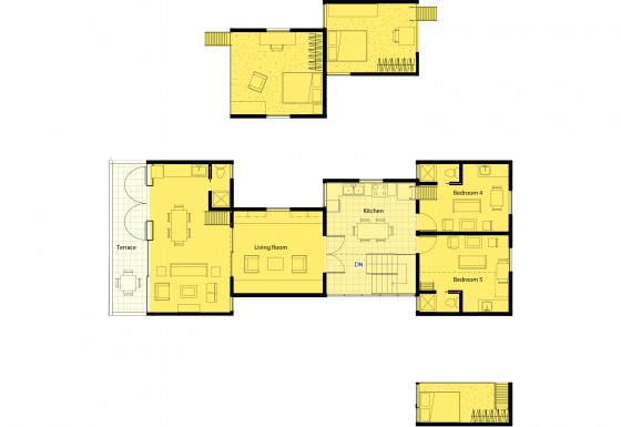
This prototype, based on a shared housing model developed in San Diego by Smith & Others, stacks three housing units on a typical 25 by 100 foot lot which contain a variety of sub-‘suites’. The 15’ tall rooms contain sleeping bunks above the bathrooms to free up general use space.
They are arranged in the traditional fashion two rooms facing the street and two rooms facing the inside of the block on each floor. Since the sub ‘suites’ are small, averaging 250 square feet, there is a large interior space remaining free to augment the rooms with anti rooms, courtyards, laundries, kitchens and cross ventilation.
Beyond achieving affordability, families and individuals can enjoy, music rooms, workshops, and offices not available in the same way to apartment dwellers. An individual‘s room, where full domain is exercised, may also be a place to invite neighbors to share a specific utility, like space to set up a ping pong table. The plan is flexible allowing optional domain boundaries. Even a main house kitchen may “belong” to an individual. Experience with this arrangement has demonstrated a real advantage in household order, a common complaint in shared houses.
Watch video of the team's full presentation
Download project PDF
no comments

